
Introduction
Wayfair is a popular online store that sells a wide range of home goods, including furniture, décor, and appliances. It's designed to be a go-to place for all your home shopping needs.
Redesign Challenge
The Wayfair website suffers from a cluttered layout, making navigation difficult due to repetitive subcategory listings and closely packed elements. Users are overwhelmed by numerous product cards and sale banners, hindering their ability to focus on desired items. To address these issues, I streamlined the site by removing excess sale banners and consolidating subcategories. I reorganized product categories and increased spacing between elements to create a cleaner, more intuitive interface, enhancing usability and user engagement.
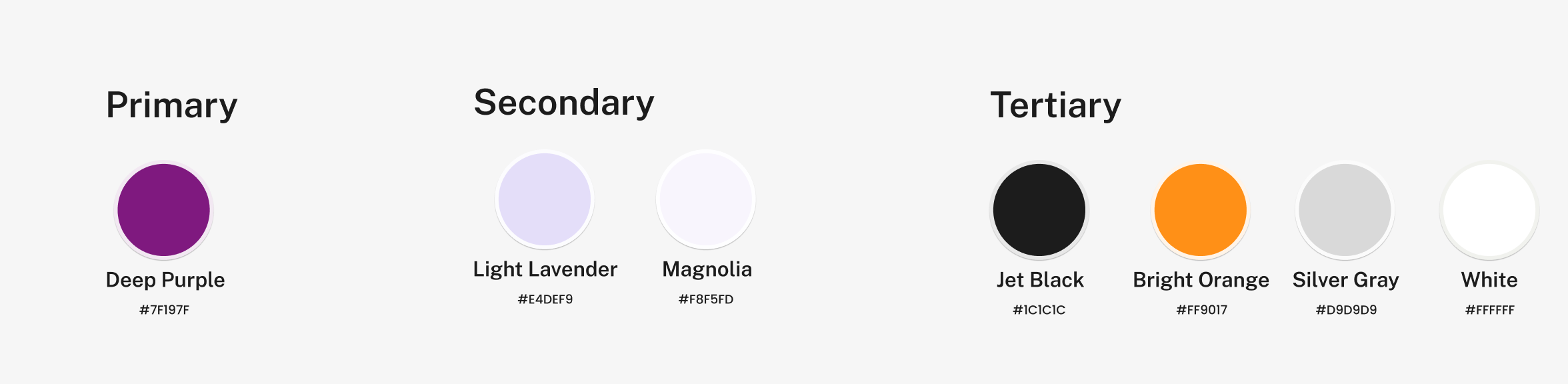
The chosen color palette reflects the essence of the brand, ensuring consistency with the original website while enhancing its visual appeal. The deep purple (#7F197F) serves as the primary color, conveying creativity and sophistication, complemented by the light lavender and magnolia for a soft, approachable feel. Jet black and silver gray provide contrast and clarity, while the bright orange adds energy and highlights key elements. The palette ensures a balanced, modern, and user-friendly design.
I chose Public Sans for its clean, modern, and highly readable style, ensuring a professional and user-friendly experience throughout the design.

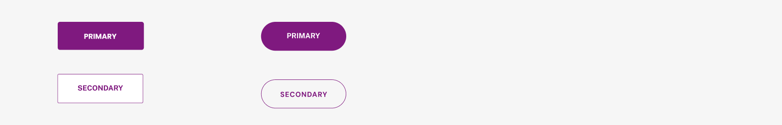
The button design includes two styles rounded buttons with a larger radius for primary CTAs creating a bold and inviting feel and buttons with a smaller radius for secondary actions and regular interactions.
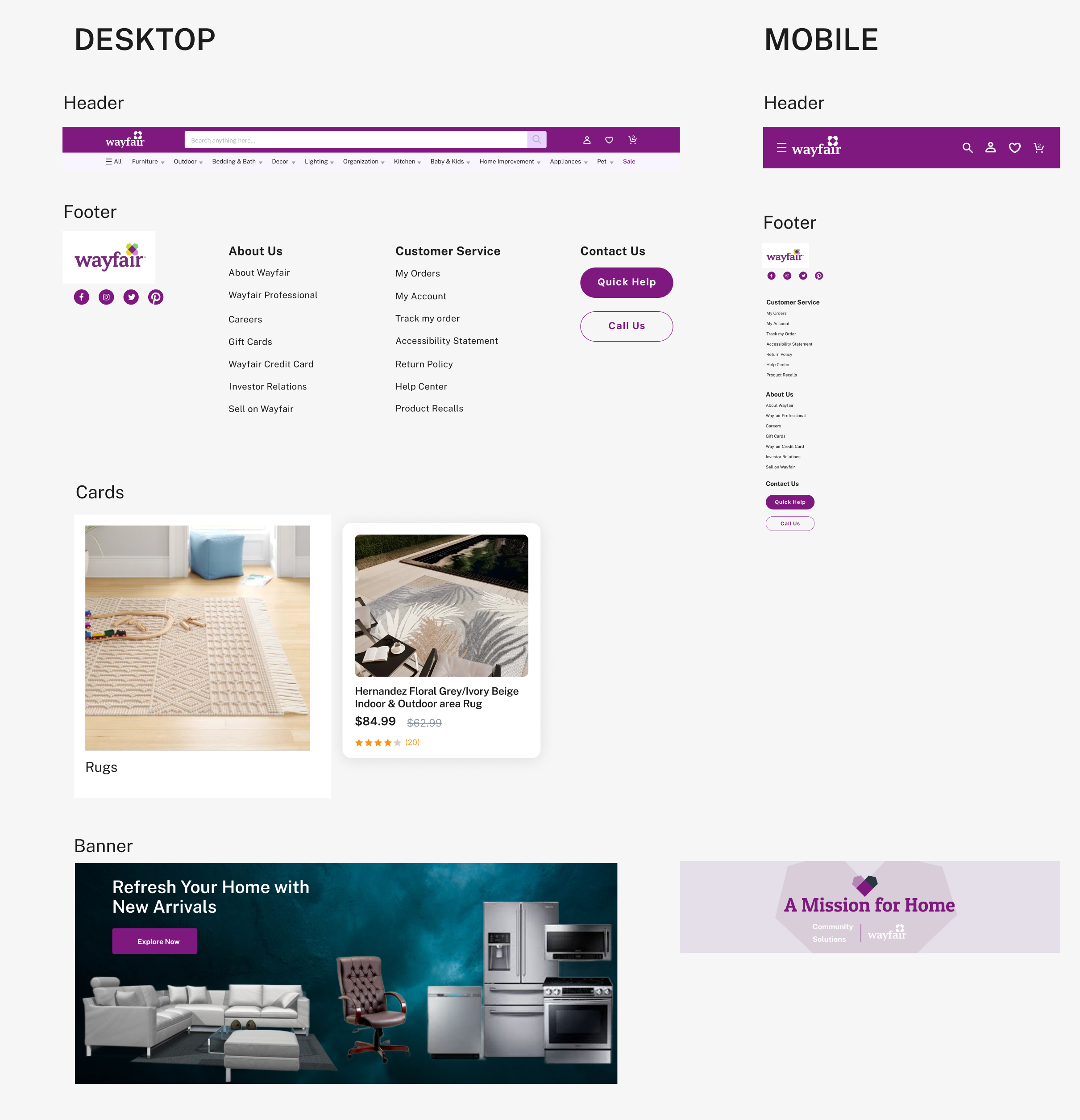
On the home screen, I made several updates to enhance the user experience. The header now features clear icons and a dropdown menu for categories, replacing text for a cleaner look. A new hero banner highlights our latest features with easy-to-navigate slides. Product cards have been enhanced with a cart icon for quick shopping, while streamlined banners reduce clutter and emphasize available items. The department sections now have distinct headings for better navigation, and the community section is unified with a single cohesive banner. Lastly, the footer was refined for improved alignment and aesthetics.
For the product, I made several enhancements to improve navigation and user experience. Each department now features separate banners to highlight important items, making navigation more intuitive. Large photos with a "See More" option reduce scrolling and streamline exploration. A "Popular Picks" section was added to each category, enabling users to quickly select items through dedicated buttons. For the furniture category, banners were specifically organized to showcase products effectively, ensuring clarity and visual appeal.

I introduced breadcrumb navigation to make browsing through different sections easier and more intuitive. Product pages were enhanced with large images showcasing various angles of items for a detailed view. Descriptions were improved for clarity and better understanding, and the rating and review section was revamped to provide more insightful feedback from customers.

I simplified the cart interface by adding easy options to quickly add or remove items. Related product images were included to help customers explore similar options. The order summary was clarified, and an input field for promo codes was added to streamline the checkout process.
I enhanced the user experience by simplifying the header navigation, replacing text with clean, intuitive icons for better clarity. A dynamic slider was implemented to showcase key content efficiently, making navigation seamless. Additionally, smooth scrolling for section photos in mobile view ensures a fluid and engaging browsing experience.


Separate banners were created for each department page, showcasing important items and streamlining navigation. Large photos with a "See More" option were added to minimize scrolling and enhance the user experience. A "Popular Picks" section was introduced in each category, featuring clickable buttons for easy item selection. For the furniture category, banners were carefully organized to effectively display products in a visually appealing and intuitive way.
Product pages were enhanced with larger, high-quality photos showcasing items from multiple angles for better visualization. User-friendly options were introduced to simplify selecting colors, quantities, and sizes, creating a seamless and enjoyable shopping experience.

A dedicated input field was added for promo codes, allowing users to easily apply discounts during checkout and enhancing the overall shopping experience.
Connect with Me
I'd love to hear from you! If you have any questions, please use the form below.