
Introduction
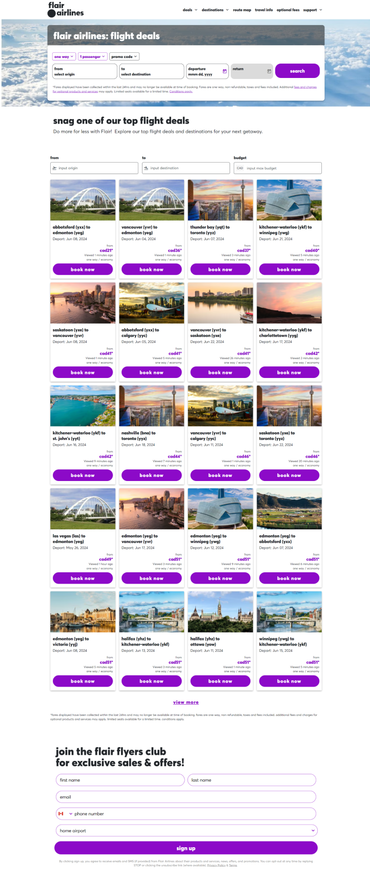
Flair Airlines, a Canadian ultra-low-cost carrier, aims to make air travel accessible to everyone. However, the current website design presents challenges that hinder user experience and booking efficiency. As more travelers seek affordable options, a user-friendly platform is essential for promoting the airline's services and enhancing customer satisfaction.
Redesign Challenge
The Flair Airlines website currently suffers from usability issues, including a cluttered interface and complicated navigation. Users find it challenging to locate essential information about flights and fares, which can lead to frustration and lost bookings. The redesign aims to simplify navigation, streamline the booking process, and enhance visual hierarchy, ensuring a more user-friendly experience while maintaining the brand's identity as an affordable travel option.
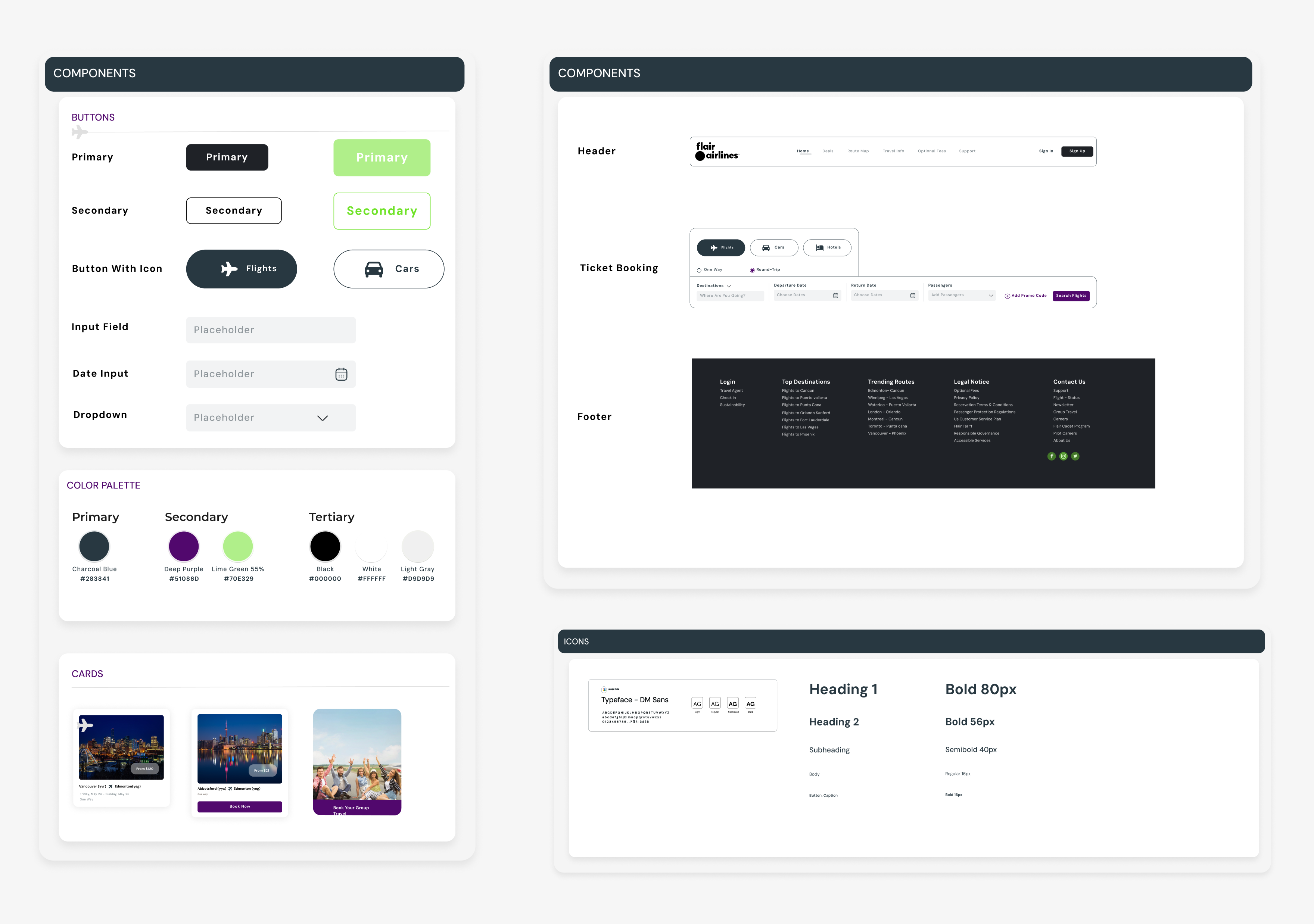
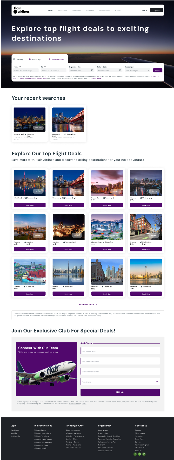
I chose DM Sans for improved readability, featuring uppercase first letters for clarity. Enhancements include a full-screen header with a "Sign Up" button, intuitive input fields for booking flights, modern buttons with rounded corners, and cleaner card designs with shadows. The layout was optimized with left-aligned text and a concise form, improving usability and reducing clutter, while the footer was shortened with key links for easier navigation.
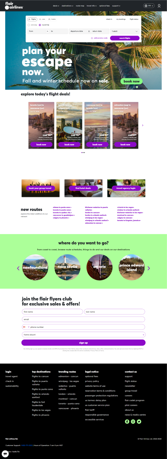
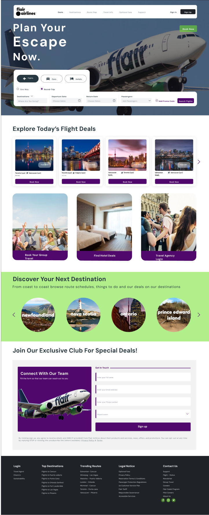
The header and home screen were streamlined to offer a cohesive look with clear menu selection indicators, enhancing both usability and aesthetics. The booking flight card was redesigned for a sleek, modern appearance, improving user-friendliness. A recent searches feature replaced the budget form, allowing users to easily find budget-friendly destinations. Cards were simplified, displaying only essential information for better readability. A "Show more deals" link with a dropdown icon was added to provide users with more travel options, while maintaining a consistent header design for a familiar, intuitive experience.
Connect with Me
I'd love to hear from you! If you have any questions, please use the form below.