

Introduction
Air India, the national carrier of India, has a rich history and a legacy of connecting travelers both domestically and internationally. Despite its heritage and extensive network, the Air India website currently struggles to provide users with a seamless and intuitive online experience. This redesign aims to modernize the website, enhancing its usability while ensuring that it reflects the brand's commitment to quality service and the essence of Indian hospitality.
Redesign Challenge
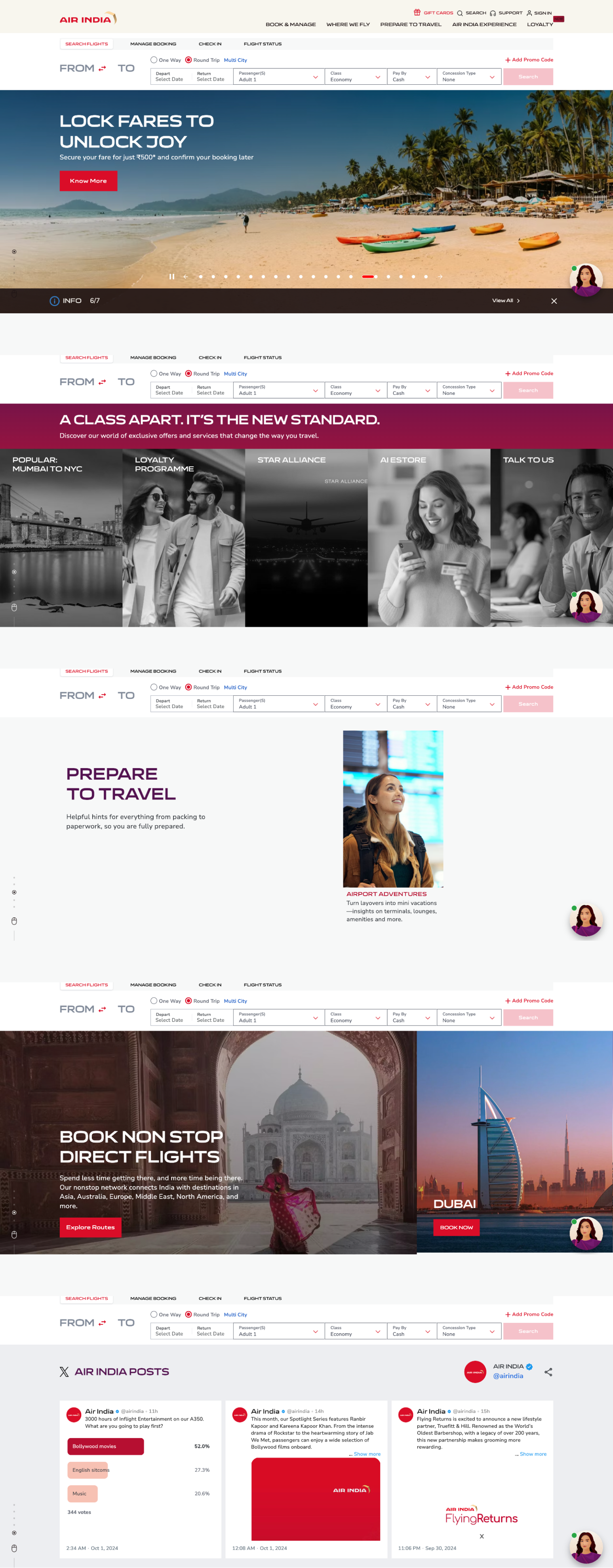
The Air India website faces several usability challenges, including a complex layout and unclear navigation paths. Users often struggle to find essential information, such as flight details and booking options, which can result in a frustrating experience. The redesign aims to simplify the interface, improve navigation, and enhance the overall user experience, ensuring that travelers can easily access information and complete bookings efficiently while reflecting the brand's heritage and commitment to service excellence.
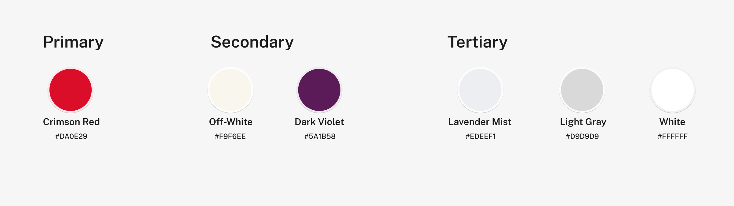
I chose a color palette for Air India that blends bold red and deep purple to reflect energy, luxury, and trust, aligning with the brand’s premium identity. Soft off-white and neutral tones balance these vibrant colors, creating a modern, welcoming atmosphere while enhancing the user experience.
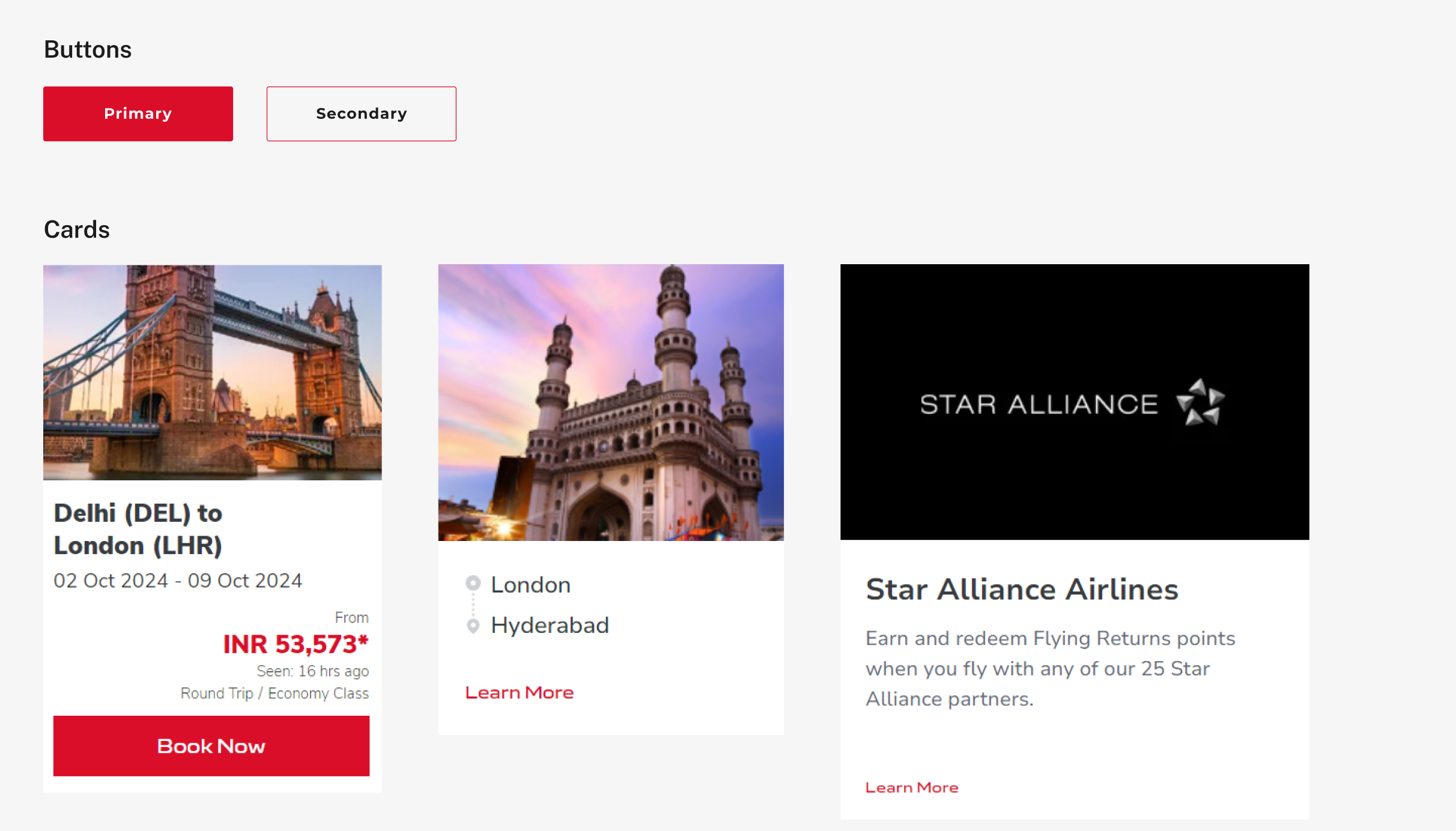
Simplified the homepage by reducing distractions and emphasizing key features like flight bookings and check-ins for quick access. Organized the font structure with dark text for better readability and redesigned buttons with high-resolution visuals for improved usability. Minimized unnecessary images and animations to enhance focus and improve load times, while smooth scrolling ensures a seamless user experience.
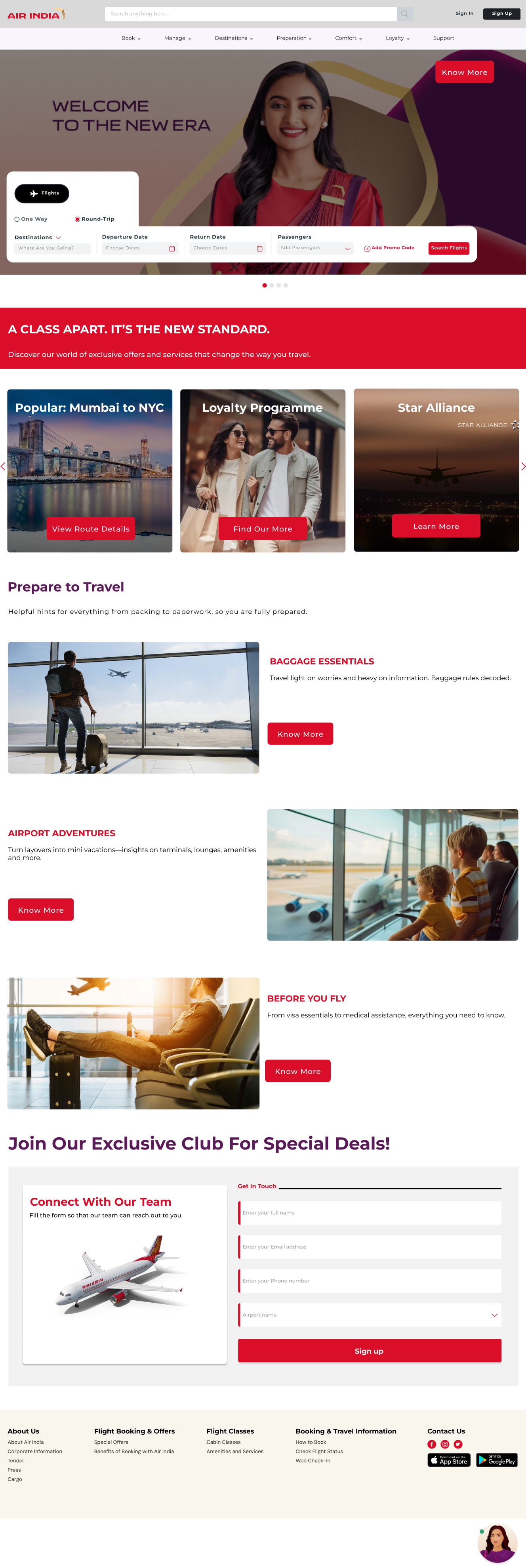
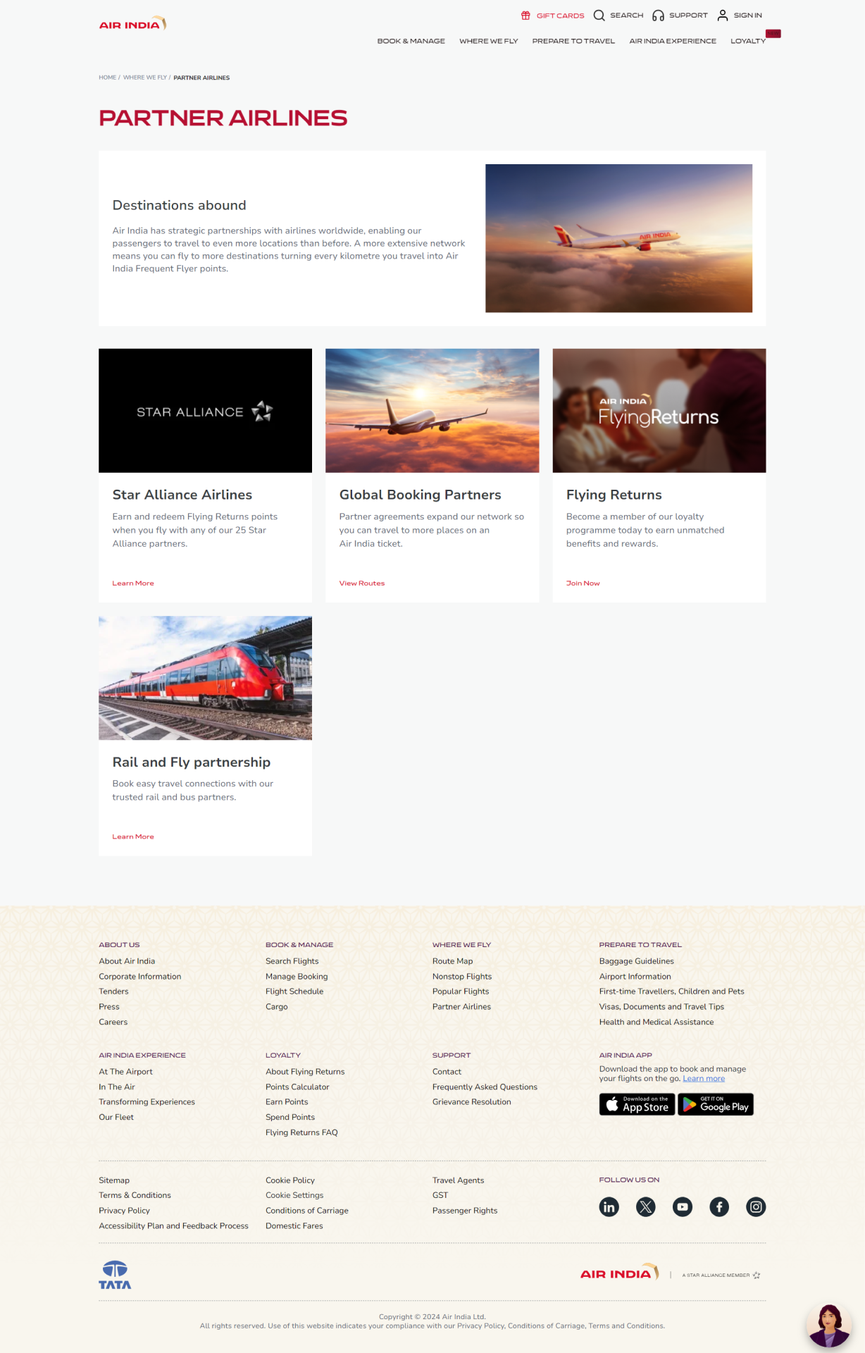
Added hover effects for menus and cards to enhance interactivity, rounded buttons for a modern look, and a consistent footer design. Simplified the layout to prioritize booking features, ensuring a clean and user-friendly experience.
Improved the header with clearer visual separation by adding a background color and drop shadow to make it stand out as the main navigation area. Included images for added interest and incorporated vibrant colors and interactive elements to enhance the design. Converted the "Learn More" text into a button with a clear call-to-action, featuring hover effects. Simplified the footer by removing repetitive content and focusing on essential links for a cleaner, more efficient navigation experience.
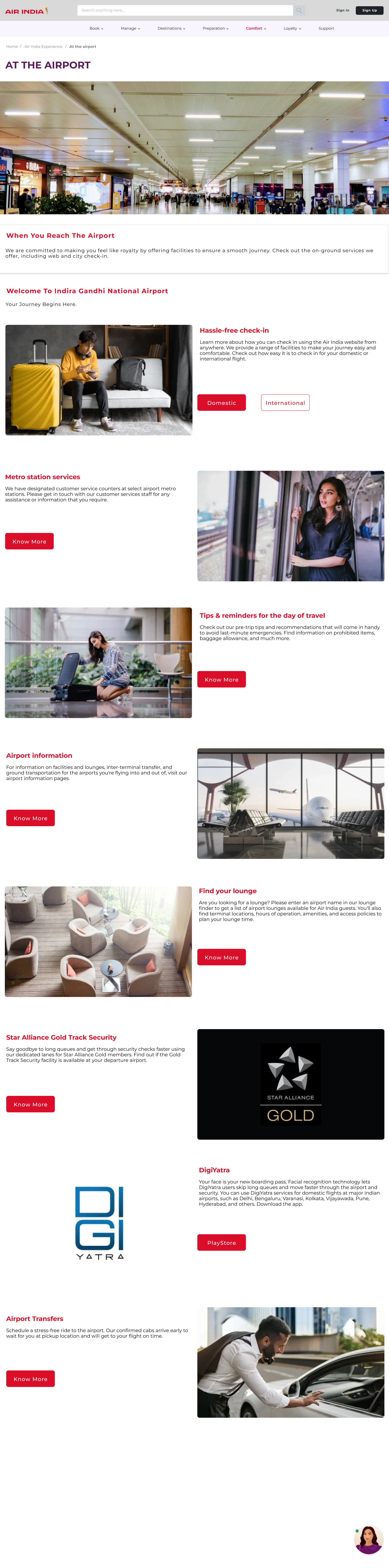
Created a clear and visually distinct header to enhance navigation. Introduced high-quality images and videos showcasing the airport experience, including lounges, boarding processes, and amenities. Added hover effects such as color changes, shadow effects, and slight enlargements to provide interactive visual feedback and improve the overall user experience.

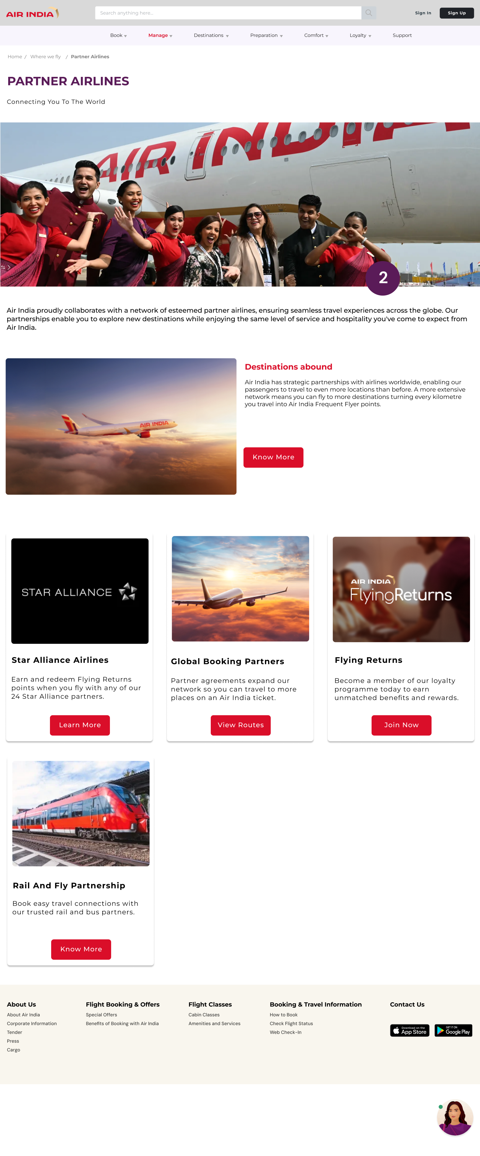
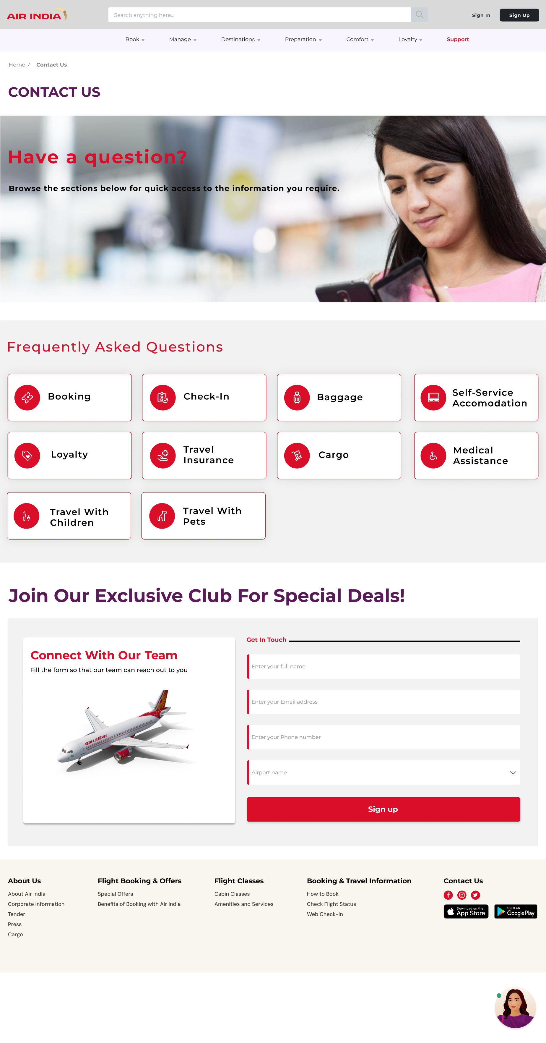
I updated the header for better visual separation from the body, improving clarity and readability. A cover image was added along with more information to increase visual appeal and engagement. Hover effects were implemented for links and buttons, making them responsive to user interaction, which helps users easily identify clickable elements and enhances the overall interactivity of the page.
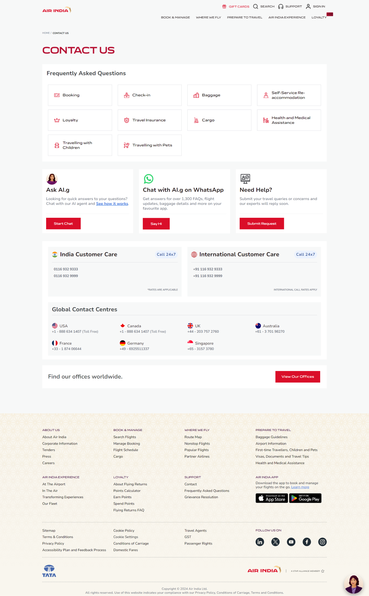
I selected a modern, sans-serif font to improve readability and maintain a contemporary design aesthetic. The "Contact Us" page layout was aligned with the rest of the website, ensuring design consistency for a seamless experience. I optimized white space to create a balanced and inviting look, keeping the page visually appealing without feeling too sparse. Additionally, I reduced the footer size to highlight key contact details, making them easily accessible and minimizing the need for excessive scrolling.
Connect with Me
I'd love to hear from you! If you have any questions, please use the form below.